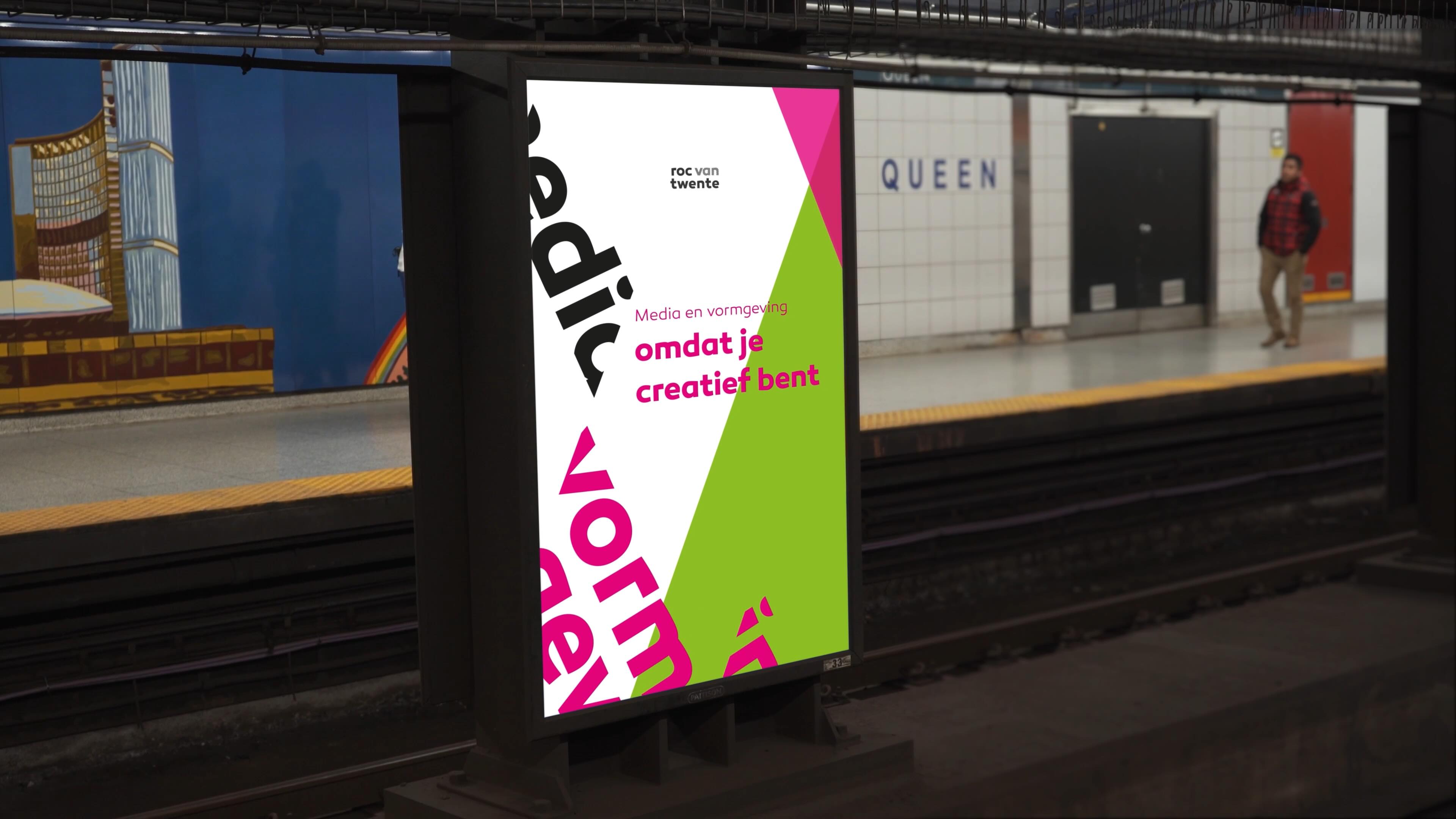
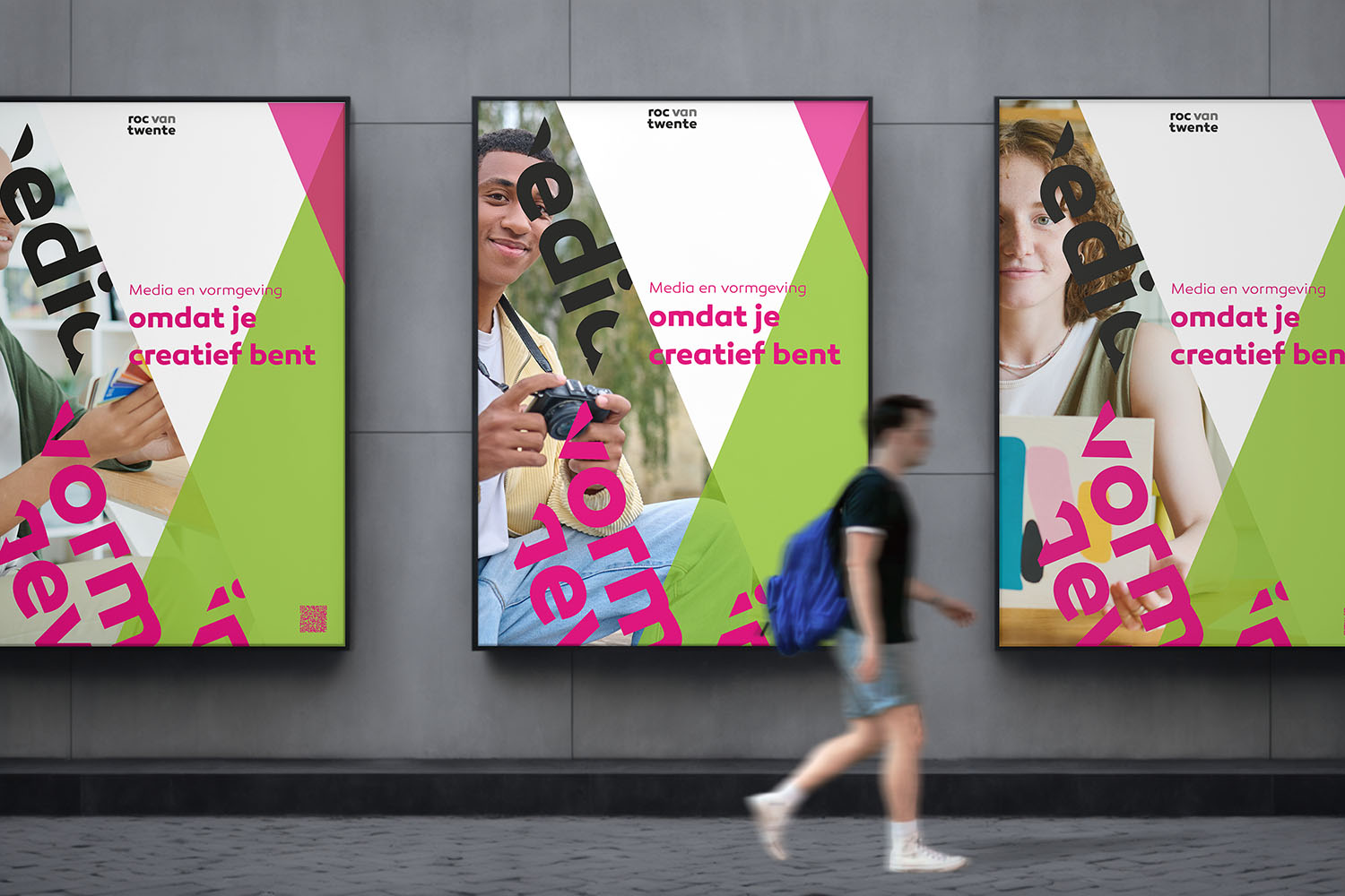
Roc van Twente, omdat je creatief bent.
ROC van Twente - A Creative Campaign with a Twist
For this project, I had to create a campaign aimed at 15-17-year-olds interested in creative fields like graphic design, web design, and animation at ROC van Twente’s Media Design program in the Maere building. With less than a week to deliver, the biggest hurdle was navigating the school’s strict brand guidelines, which were more suited to a corporate audience. This made it challenging to connect with the younger, creative demographic.
My Approach
This project was a challenge, but I was determined to find a solution that stayed true to the brand while still appealing to our audience:
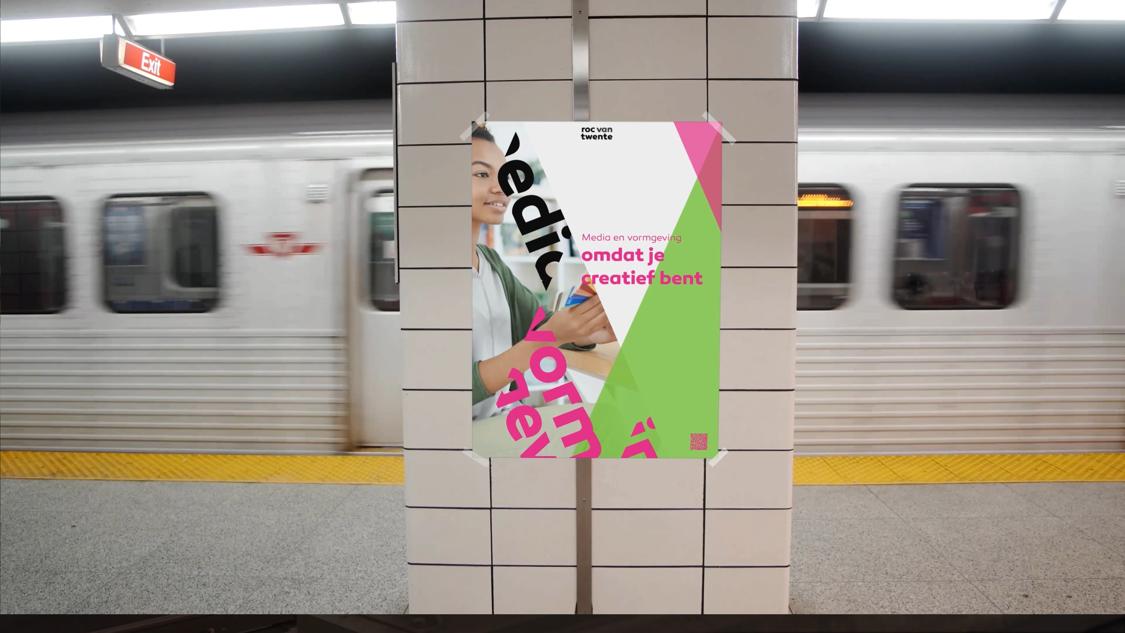
1. Poster Series (3 Variants): I kept the school's color palette and typography from the guidelines but played with layouts and imagery to create fresh and engaging posters for teens.
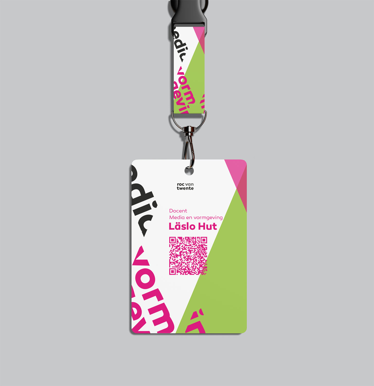
2. Teacher ID Card for Open Houses: I designed this to be professional yet visually appealing, ensuring it complemented the overall campaign while being practical for teachers during events.
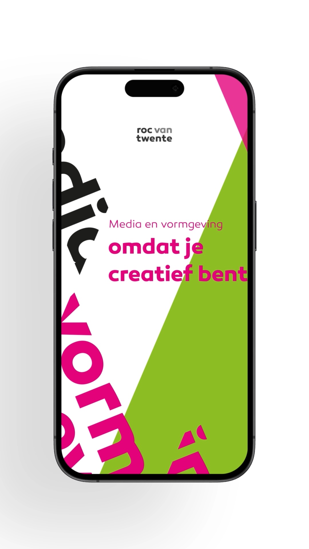
3. Motion Poster/Instagram Story: Knowing how our audience interacts with content, I created a motion poster that worked perfectly on Instagram—short, dynamic, and eye-catching.
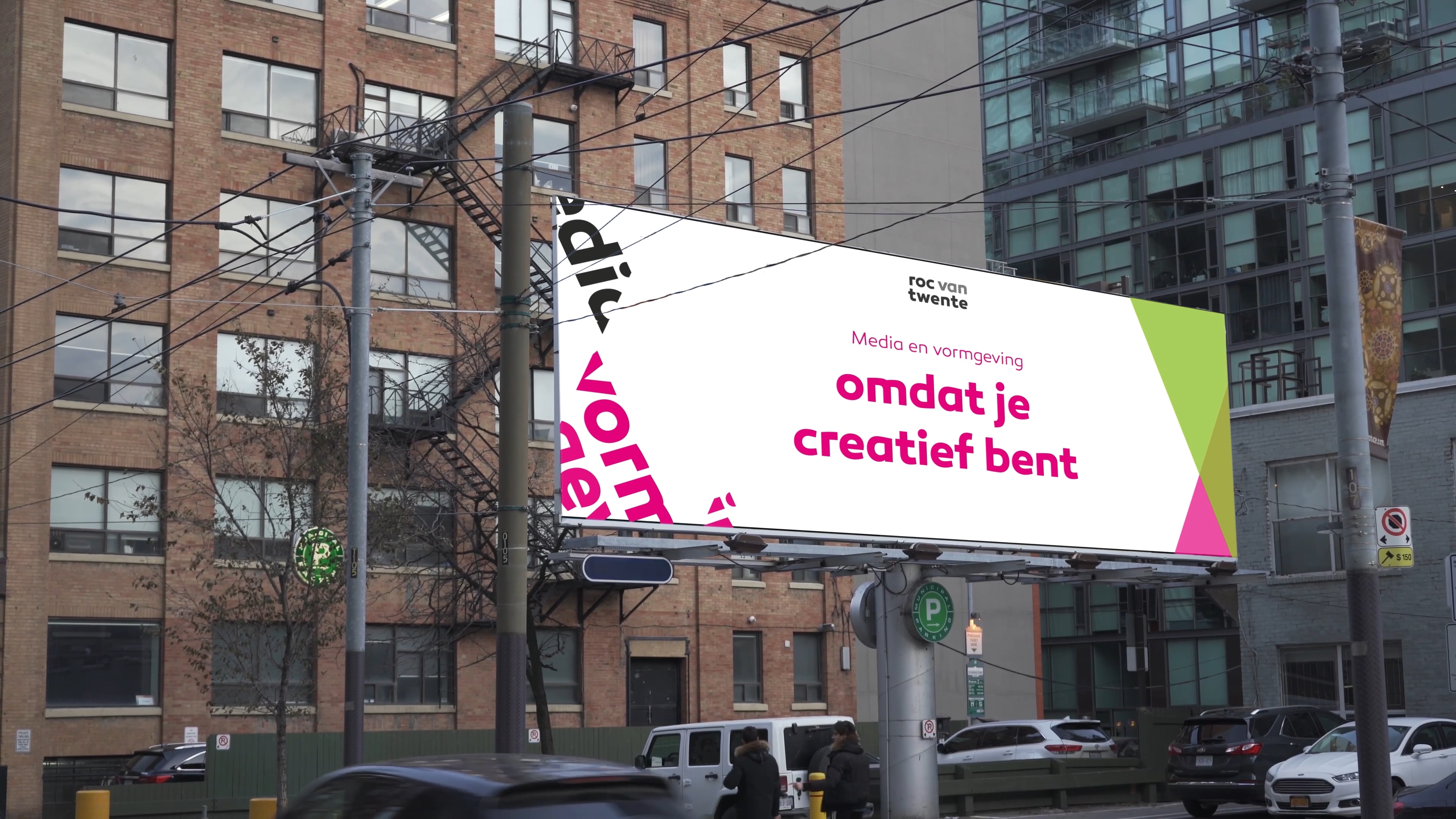
4. Billboard: The billboard design focused on being bold and straightforward, effectively capturing attention in busy environments.
Lessons Learned
This experience reinforced the importance of flexibility within brand guidelines. While they ensure consistency, it’s crucial to adapt them creatively when trying to engage a specific audience, like the creative teens we were targeting.
Wrapping It Up
Despite the tight timeline and constraints, the campaign effectively balanced the need for brand consistency with the creative appeal necessary to attract our target audience. It was a rewarding challenge, and I’m happy with the result we achieved.
- Jona Esajas
- Huub van Midden
- Indy ter Beek
- Tyscha van den Hooven
