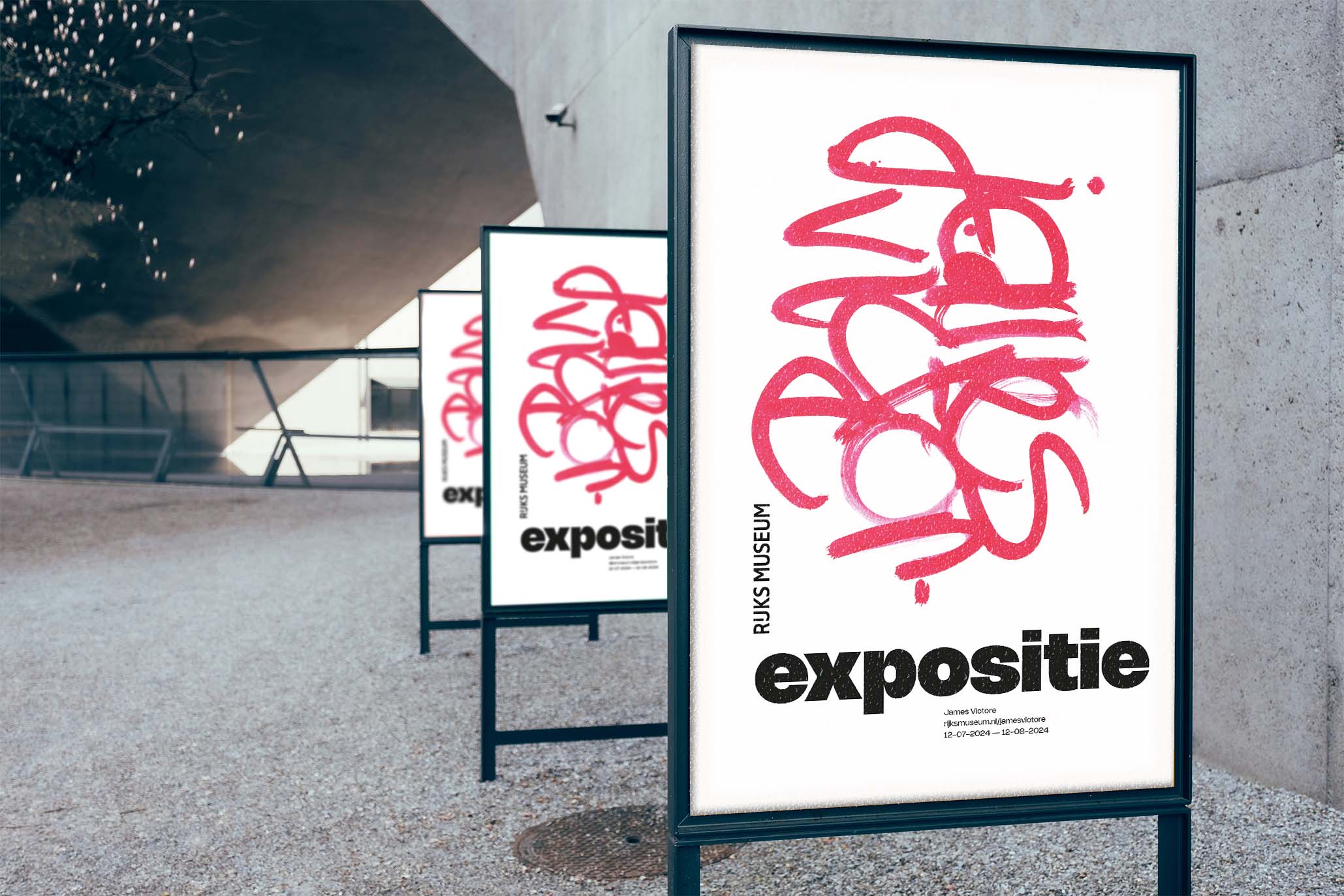
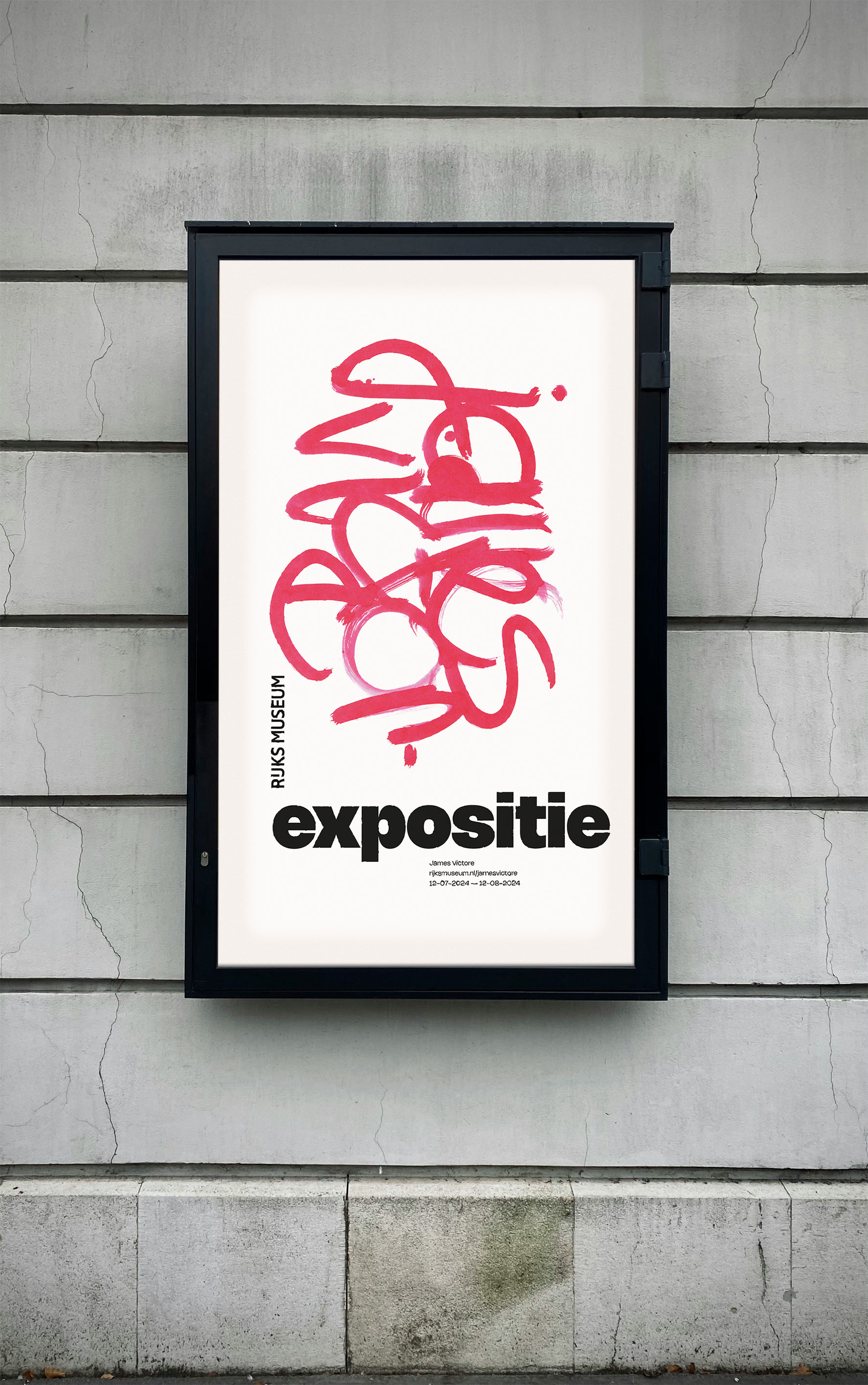
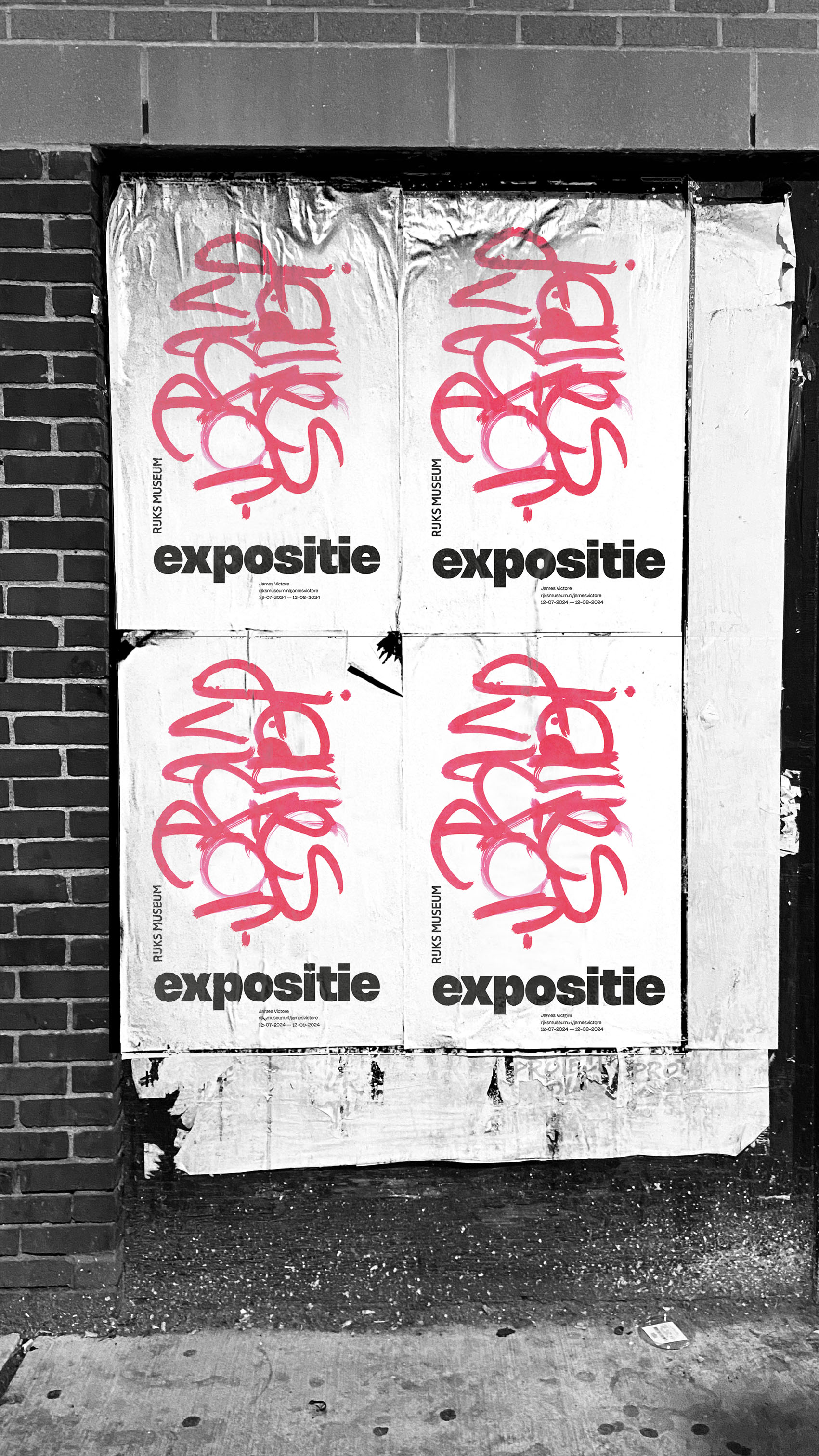
An Exposition poster for James Victore
Designing a poster to advertise a exposition.
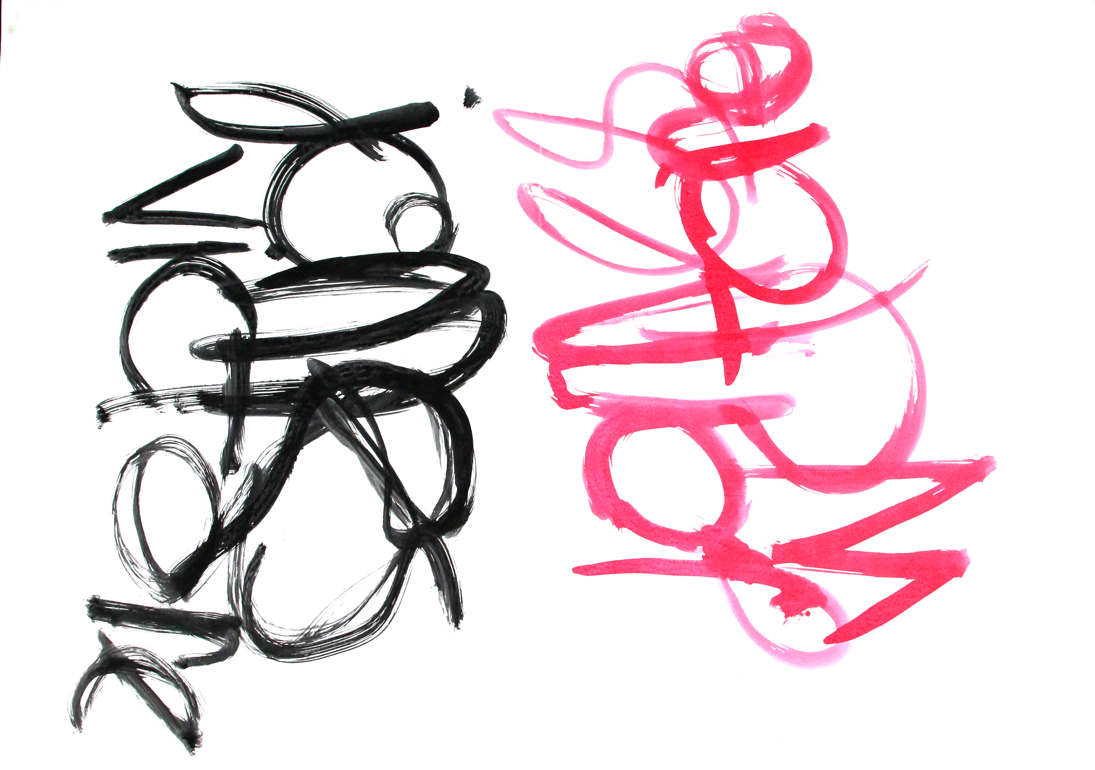
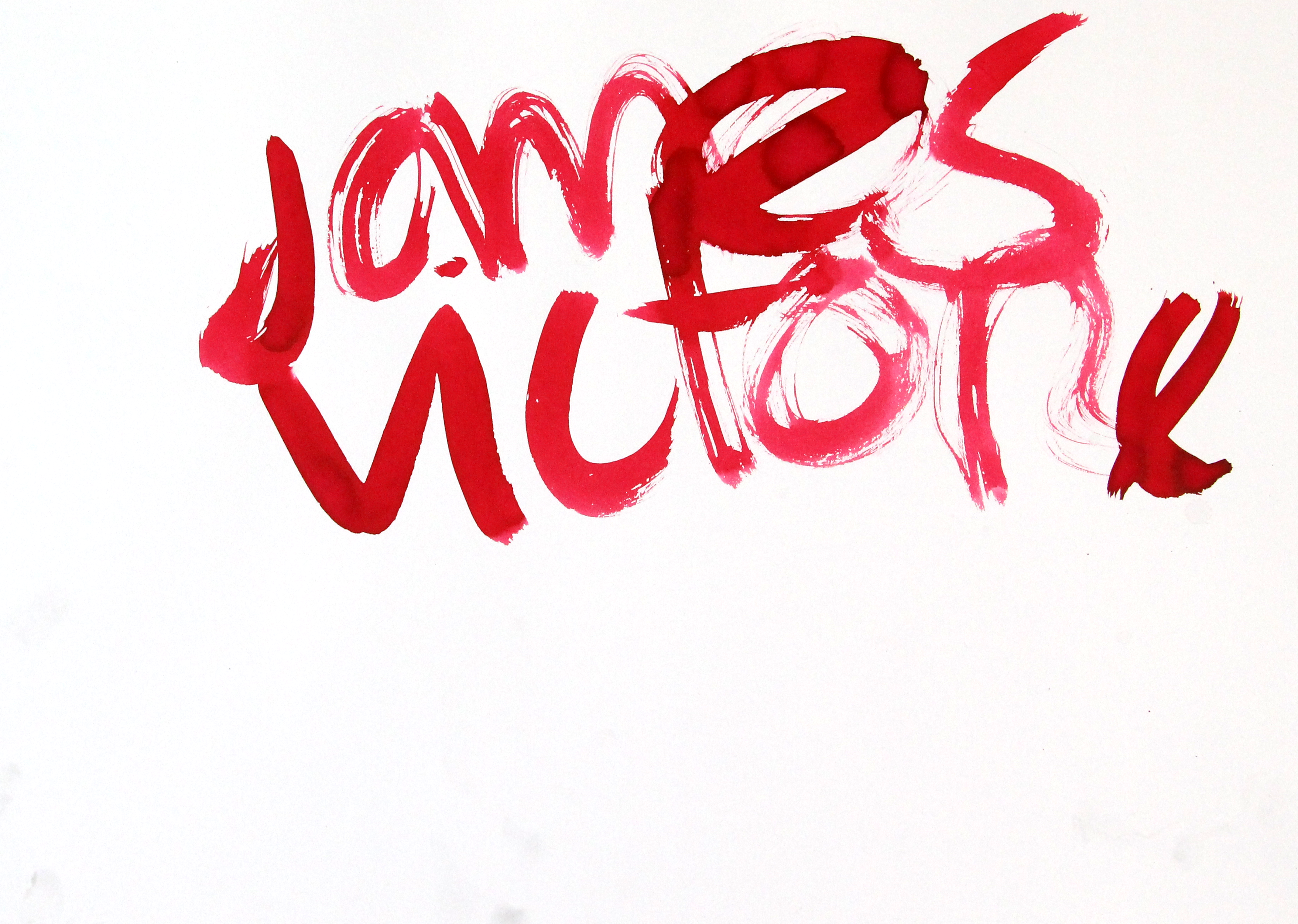
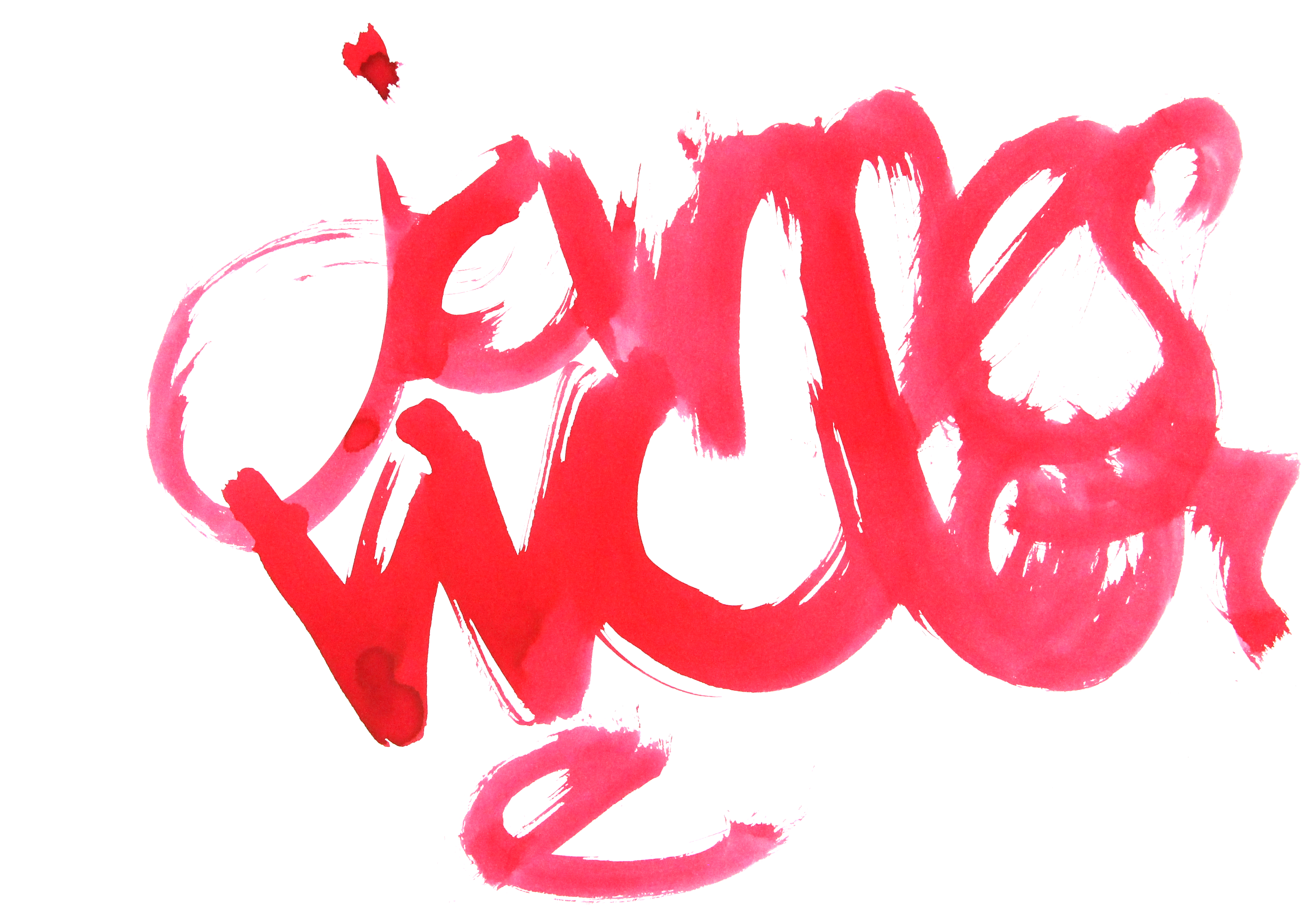
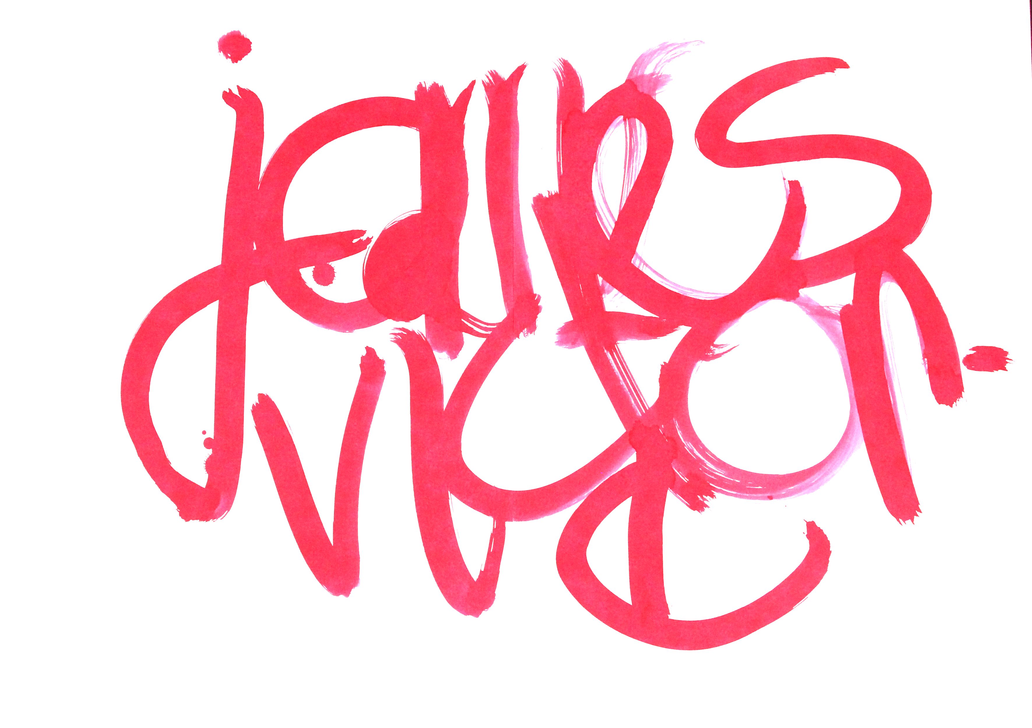
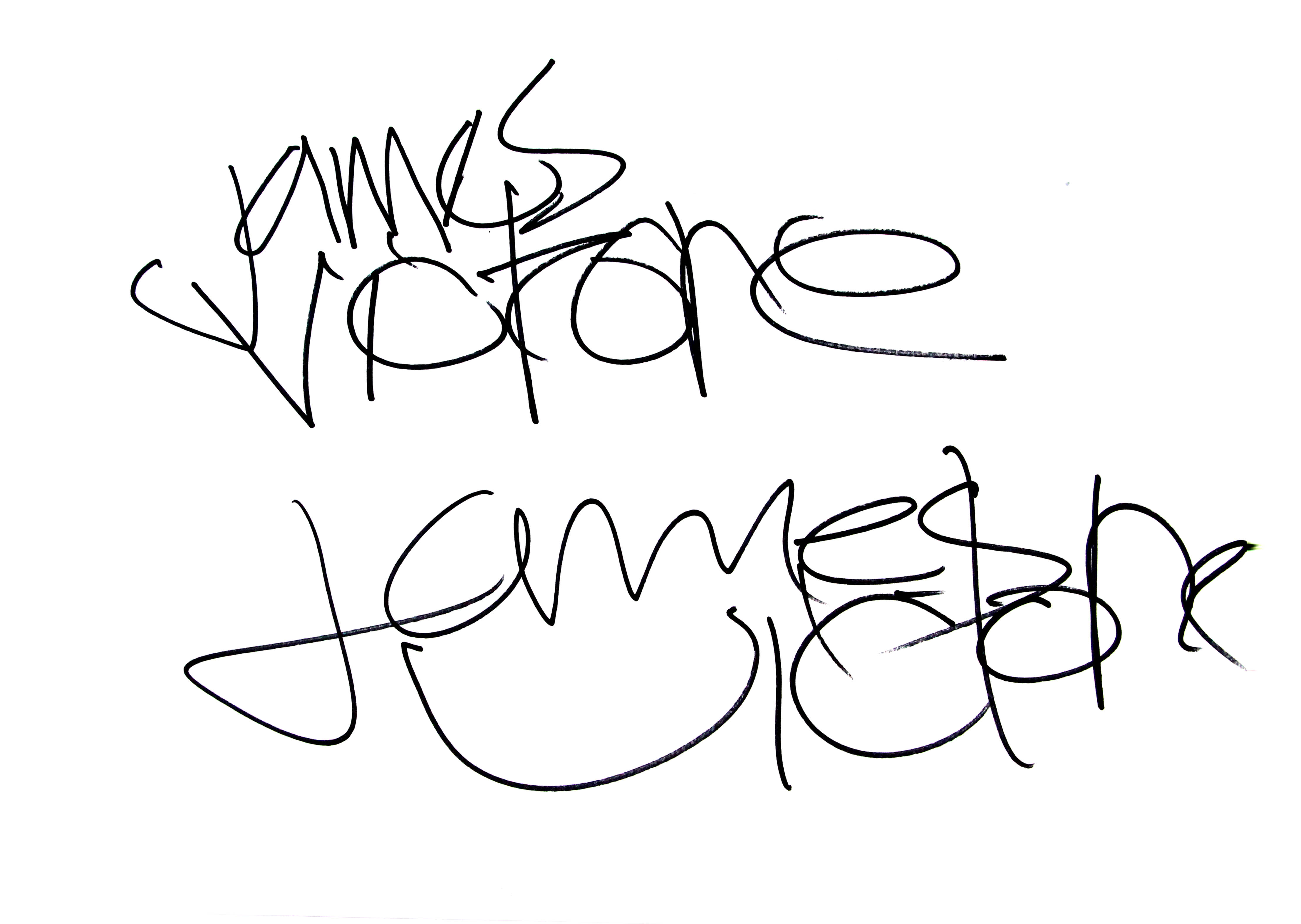
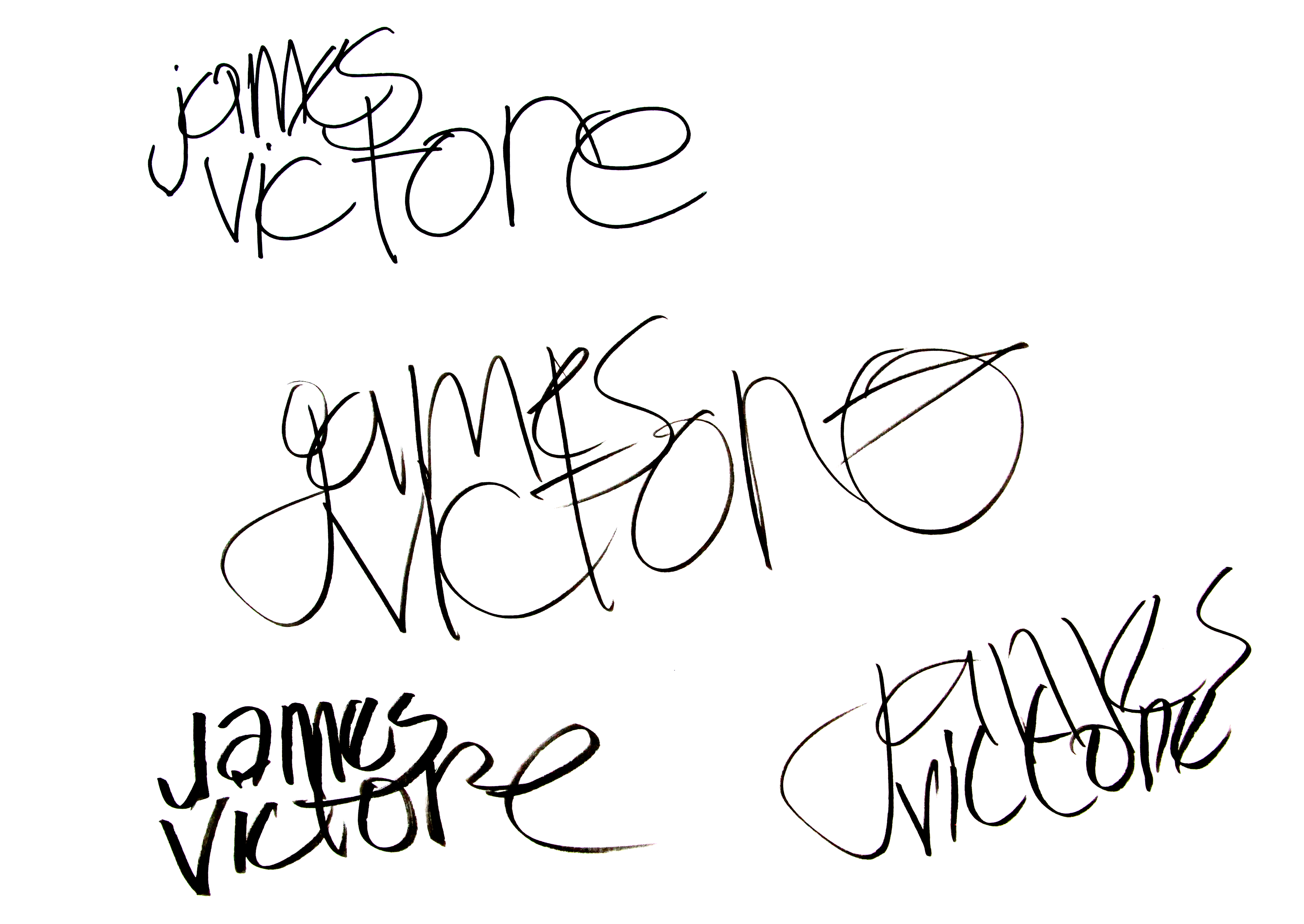
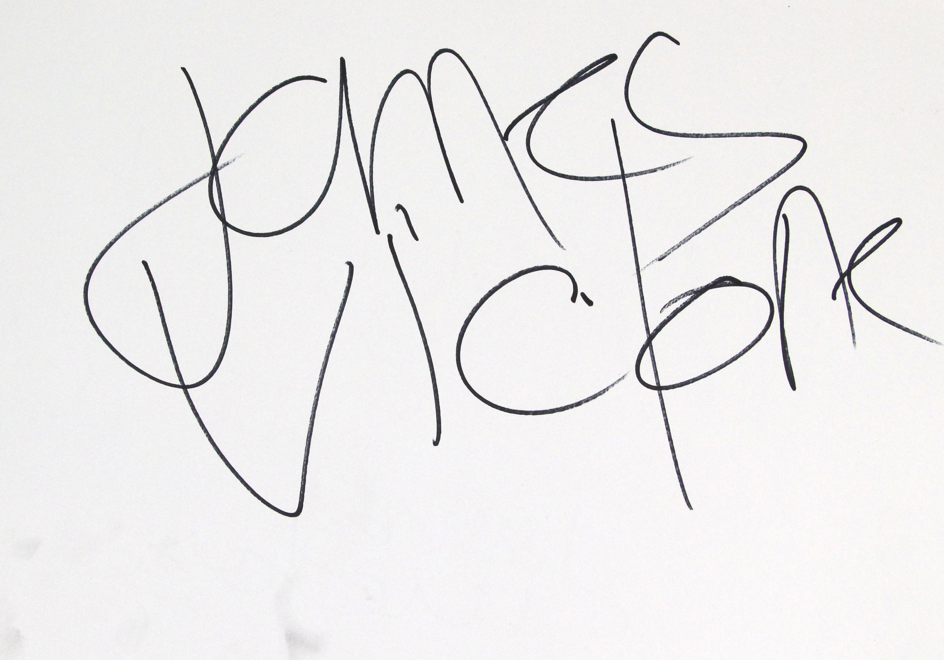
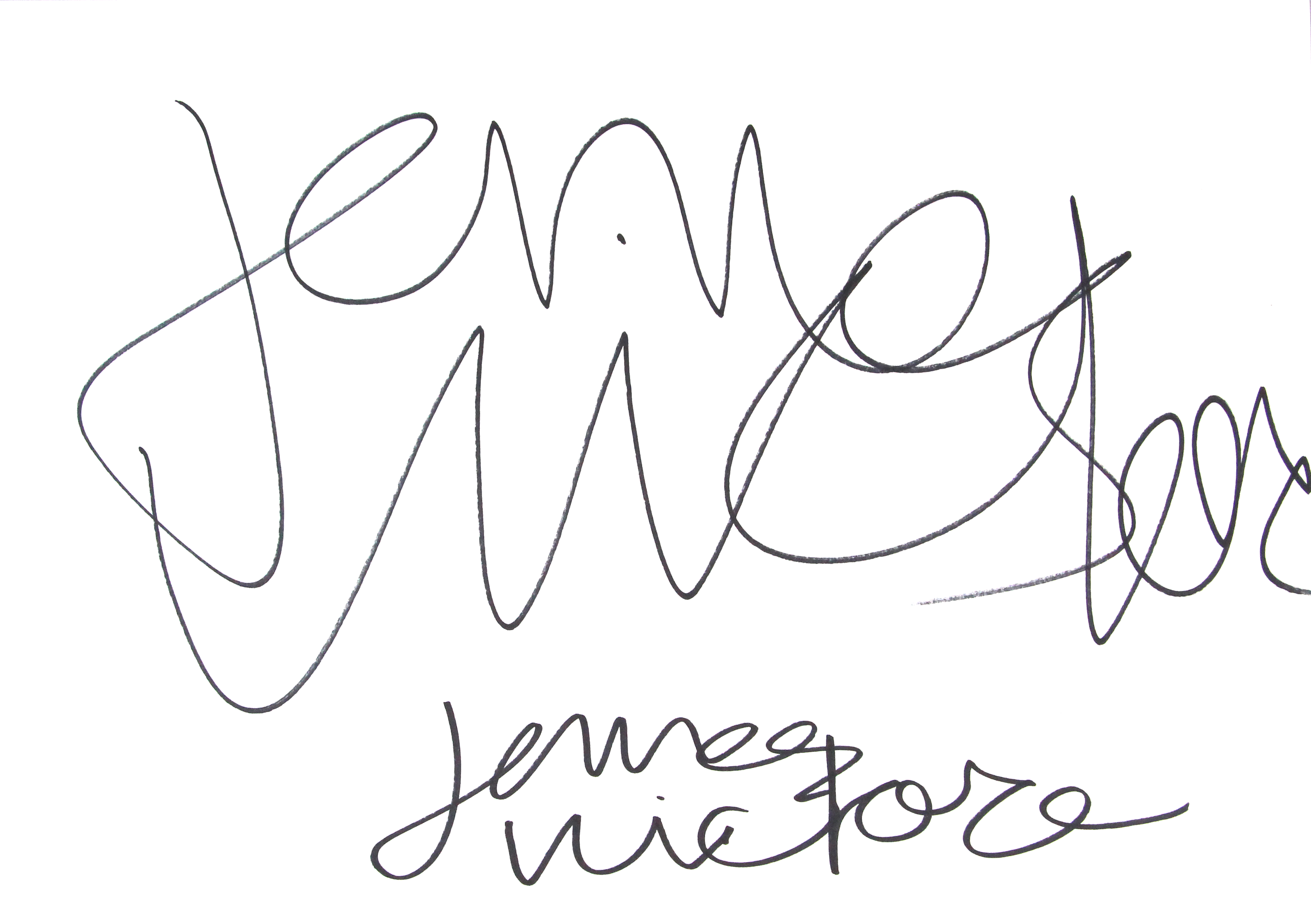
I had the pleasure of creating a poster for an exhibition to honor the designer James Victore, a well-known artist/designer who uses type as a way of sending a message, he is totally against the idea of perfection and he has written a book called “Feck Perfuction” where he makes his hate towards the idea of perfection loud and clear.
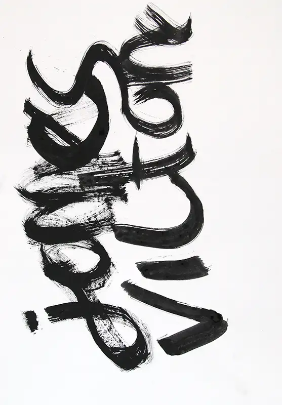
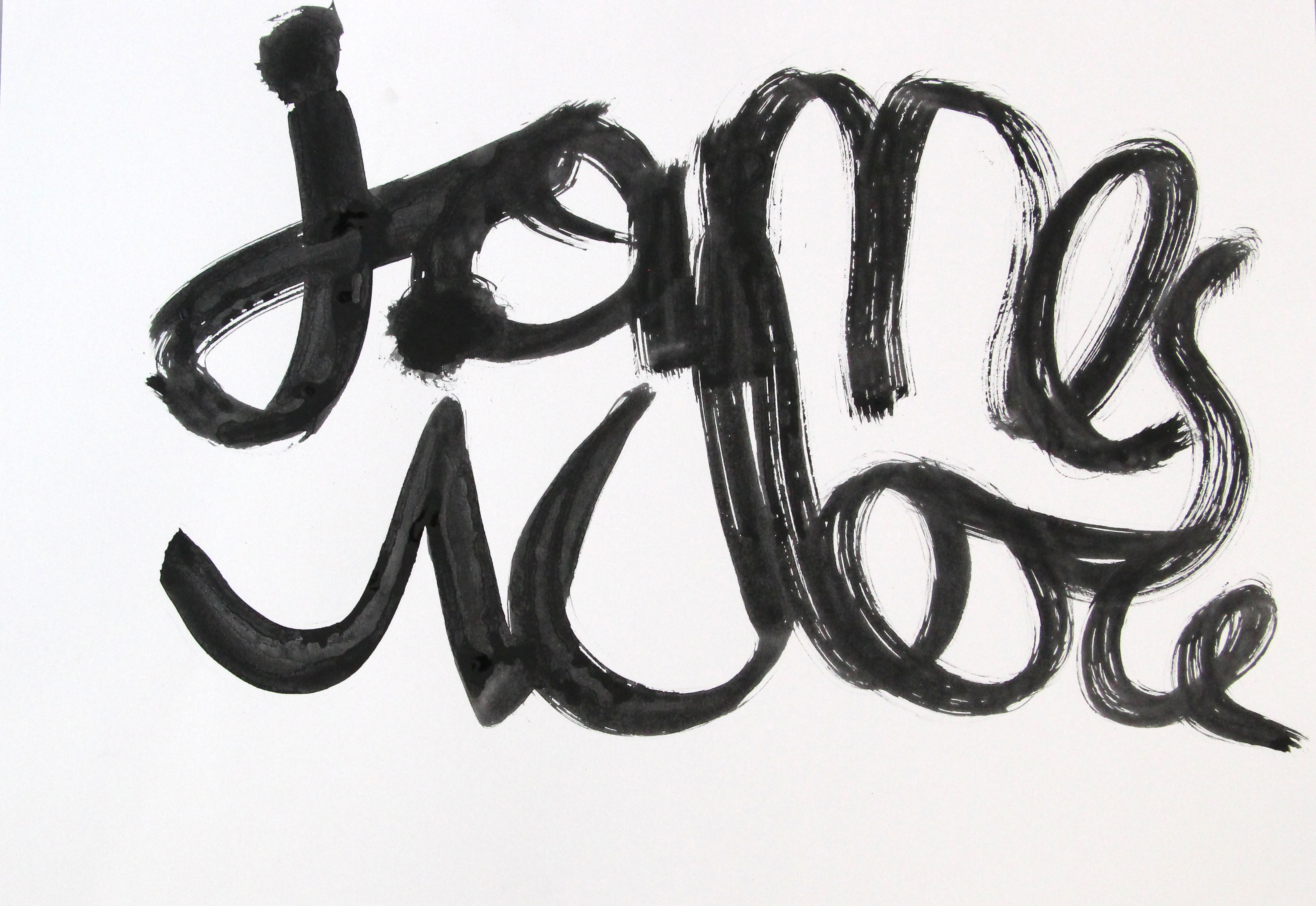
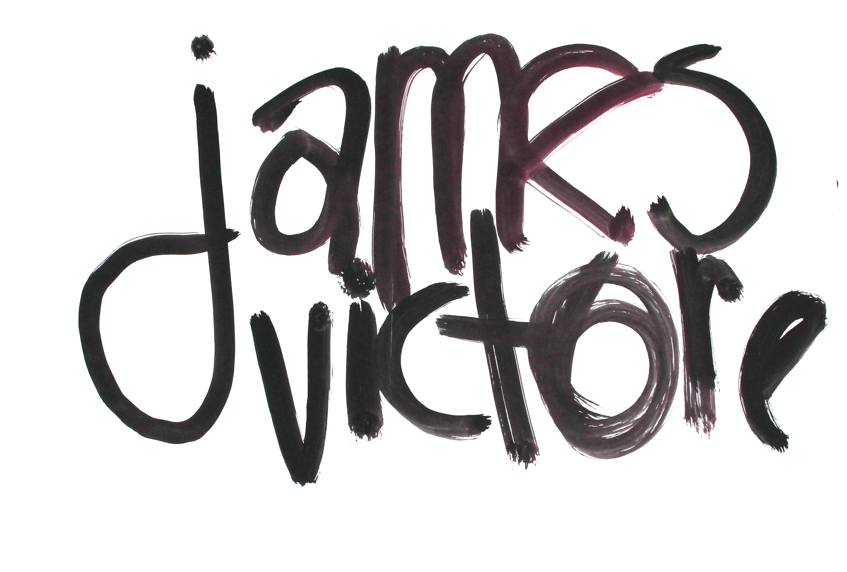
This fictional school project was interesting to create. I had the opportunity to use creative typography, something that already interests me. The Victore style asked me to experiment with different writing styles and supplies. This experimental phase was now an important moment in the design process. The exciting task of filling different sheets of big-sized paper with the writing of one name, formed in various styles, already shaped the prominent illustration for the poster. Now I had a fitting illustration, I started fitting the puzzle pieces together. I wanted to display the Rijks Museum logo and clarify that the poster was about an exposition. That meant that the text exposition was the second most important thing in the hierarchy, the most important was the illustration that displayed James Victore name.