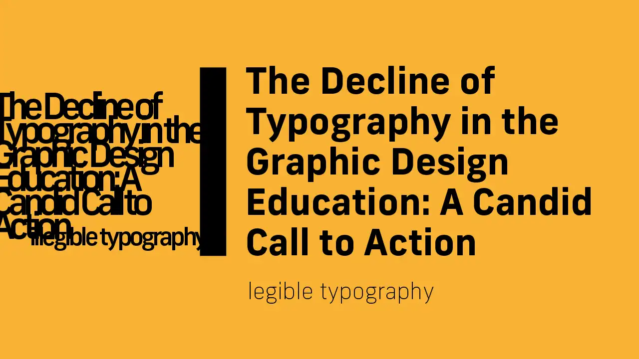
Is Typography Dying? The Decline of Legible and Illegible Type
"Hey, I’ve been studying design for a while and learned a few shocking things. Guess what? Typography—the design principle ensuring our texts are functional and interesting—is sidelined by Dutch authorities. They want to push for jack-of-all-trades designers, and our friend typography is getting pushed away. Let me tell you, it’s not just a minor oversight; it’s a big miss!

Before my time as a graphic designer, mastering the ins and outs of typography was nothing less than required for every designer. You got to play with kerning, leading, and experimenting with all the typefaces (back then there was still a limited selection of only great typefaces). Now, many students don't even know what kerning and leading are. They expect the software to do it for them (in reality, the software is just guessing), and the new students are wrong to think that; these are still choices that are up to the designer, so you need to make these decisions consciously and not let the software make these important choices for you.
It feels like typography is treated as if it is something old, useful only for dusty old books and magazines. And since when did books become uncool, right? Also, forget the books; even if books were uncool now, typography still has its place. While people may read fewer books, they read more than ever short content online. In this space, typography plays a vital role; the importance of having the type stand out and having readable text is massive because everyone is focused on easy-to-process information; this is caused by the evolution of social media.
Here’s the scoop: typography isn’t just about making things look pretty; it’s about clarity, hierarchy, and personality. Mark Boulton said, 'Most people think typography is about fonts. Most designers think typography is about fonts. Typography is more than that; it’s expressing language through type. Placement, composition, type choice.' Selecting a typeface is just a small part of typography; working with good typography requires a wider range of understanding.
Neglecting typography means our future designers might be great at slapping cool visuals together in Photoshop but won’t necessarily understand how to make those designs communicate. It’s like having a fancy sports car but no idea how to drive it—you won’t get far. Despite the push towards versatility, the essence of great design lies in its details. The Dutch government's initiative to produce all-around designers has led to a broad but shallow approach to design education, often at the expense of specialized skills like typography. Multimedia design and graphic design, while related, require distinct skill sets that are neglected in the current educational setting. The result? Designers who may know a little about a lot but lack deep, practical knowledge in any area.
It’s time to do something about it; typography should be in every design education. If you don’t like typography, you don’t like graphic design. Typography should not just be part of specialized education because it's the most important part of design. So, let's introduce courses in typography in every design school. Dive deep into the details and learn the guidelines already set about typography. Let's study great designers before us and take a deep dive into their work. Let's face it; if you look at their great design work, typography is as important as it gets.
Do you struggle with your typography? The problem isn't the lack of resources if you're interested; there is enough to find online or in books, so let's dive deep into it. A great book to start with is 'Typographic Design: Form and Communication.' If you read this and your feet aren't wet enough, there are many free resources online. If you have some struggle understanding and want help with your typography, you're welcome to send an email (contact@semmakata.com). If you don’t want to go through all this trouble, but you’re still serious about typography, let's get on a free call to talk about it. Only if you are serious about fixing your typography.
As we blaze forward in this digital age, let’s not leave typography in the dust. Enhancing typography education is not just about preserving an art form; it’s about empowering designers to create work that doesn’t just look good but communicates brilliantly. Typography is more than text on a page; it’s the secret sauce that makes content digestible, engaging, and memorable. Let’s not strip future generations of designers of this critical tool. After all, in a world where everyone is shouting, the one who communicates clearly is the one who’s heard."