Rethinking Your Logo: A Fresh Take on Modern Brand Identity
Understanding a brand identity
How can we find out the brand identity and how do we visualize this?
Two words
we have to specify for who we are creating, I find it easy to create a word selection what fits the brand. An example is Red Bull and the words they chose: excitement, extreme sport, extreme and energy. Except for the word energy other companies in their branch chose a different path. The outcome is that multiple companies can survive in the same business because they both have a different target audience.

Two-by-two grid
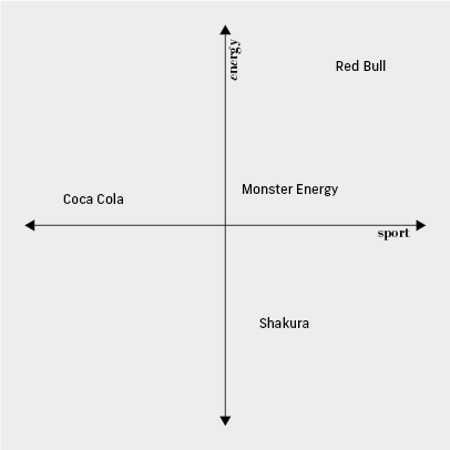
It is important that we acknowledge if a product is not meant for everyone. By using this tool, you can specify who we are making this product for. A good way of using the two-by-two grid is being explained by Seth Godin in his book called “This is marketing”. You start by choosing two words from the earlier chosen words, which has meaning for you and your customer. I recommend choosing two words that aren’t being used yet in the sector you are selling in. You must place yourself in the extremes of this meaning. Now by placing one word on the Y-axis and one word on the X-axis you created yourself a two-by-two grid. Now find your competitor in your sector and place them in the grid.

Empathy graph
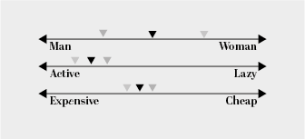
A good way of using the empathy graph I got explained by Chris Do. If you have found your words and your place in the business, try to specify your target audience. First try to find an audience that fits with your words, for example: boxers, dancers, content creators and doctors. If you have found one audience that fits your brand, try to find a regularly returning customer and define his traits. Is he more manly or more feminine? Is he more mainstream or more alternative? Try to define him in detail, by what companies does he shop regularly? Do this a total of two times, by the second one try to find a customer opposite of the first one but still fitting your audience. In between those two people, you will find your target audience.

Mood-board/ stylescape
Now it’s the time to create a stylescape, this is also something I learned from Chris Do. That’s a mood-board but with the dimensions of with: 5760px height: 1080px. A stylescape is almost the same as a mood-board, but more uniform. You already implement grids in your stylescape and fonts that fits your target audience. I recommend you create an image bucket. That’s a folder of images that inspire you for your design and fits the brand, it contains typography, road mapping, images and art. Now you can pull your images out of the image bucket and start designing a stylescape.
Now you learned that a logo should the last of your worries, first focus on a brand identity that’s correct. If you implement these steps correctly, you now know your target audience and you know what their interest is and what visual style connects to them. After all these steps you can now try to create an envelope for your brand, your visual brand identity and yes that can also include a logo.